
Contents
- Recap of Part 1
- Elements of an effective visual aid
- Example 1: Standard menu VS visual menu
- Example 2: Standard guide VS Visual guide
- Example 3: Standard instruction VS Visual instruction
- Summary
- Examples used
Recap of Part 1
In Part 1 of this Guide to creating Visual Aids, we categorized visual aids into three groups:
- Public—to communicate anonymously with people in a crowd
- One to One—to communicate with one person
- Me—to communicate with myself
If you have not read Part 1, here is the link to it: A guide to creating visual aids-Part 1
This time, we will analyze three most important elements of creating visual aids.
Elements of an effective visual aid
Creating a visual aid doesn’t depend so much on your ability to draw. You can use props, photos or illustrations and graphic design.
An effective visual aid depends on the analysis of three elements:
- The problem we want to solve with our visual aid.
- The message we want to communicate.
- The type of images that can best represent that message.
Let me explain what I mean with some examples.
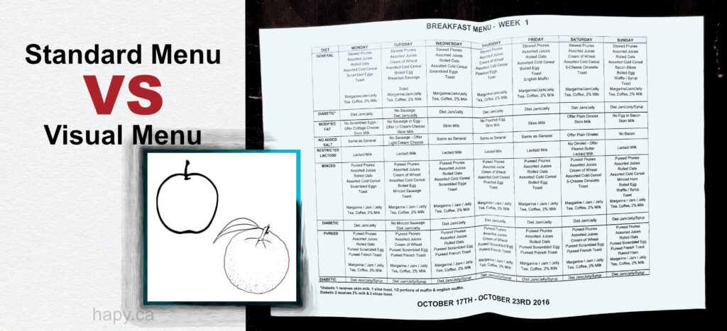
Example 1: Standard menu VS visual menu
- The problem we want to solve with our visual aid—Someone can’t read a menu.
- The message we want to communicate—Choose what you want to eat.
- The type of images that can best represent the message—Objects—like in a menu or product lists.
It could be especially effective in nursing homes and hospitals that have a problem of communicating with patients and food wasted because of that. The message on their menu is simple: make a choice of what you want to eat but many people can’t read the menu and don’t make any choices. In these situations, there is only an option of a default meal, which may not have been people’s choice had they understood what their options are.
This example was inspired by one of the local nursing homes. Their menu is printed on a large sheet of paper filled with small text that looks like a document. It is basically impossible for many people to read it.
Instead, if people were provided a simple choice between just two items but in a visual format, the possibility of them choosing one would increase.
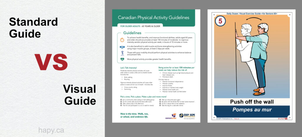
Example 2: Standard guide VS Visual guide
- The problem we want to solve with our visual aid—Physical inactivity and social isolation among seniors in a senior residence.
- The message we want to communicate—Exercise.
- The type of images that can best represent the message—Narrative image-breaking action into steps.
The example I am using here is Daily Dozen: Visual Exercise Guide—for Seniors 65+. The best way to create a visual aid here is using a narrative illustration of a person exercising.
It can be installed it on a wall such as a senior residence hallway wall and be available every time a person passes by to increase the possibility of interaction.
This project was inspired by the Canadian Physical Activity Guidelines for 65+ which did not have any graphics to explain their suggested exercise routine.
A visual aid containing narrative images is more complicated because it has to show action but its use can be very effective.
Here you can obtain a PDF copy of Daily Dozen: Visual Exercise Guide—for Seniors 65+.
Or buy a printed version available on Amazon.
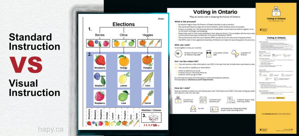
Example 3: Standard instruction VS Visual instruction
- The problem we want to solve with our visual aid—how to explain an election to seniors with language barriers.
- The message we want to communicate—you can vote, you have a choice.
- The type of images that can best represent the message—a poster with a part that can be cut into ballots.
Just like in the first example, it is about a choice but this time it is more complicated and abstract, so it is harder to create a visual aid. In abstract ideas it may seem difficult to point out the essence, but once you do, it is easy to suggest an image type.
The best image type to explain the concept of an election to our community members is a series of familiar objects in a poster. We have three categories of food with three representatives in each group. We use fruits and vegetables to explain the options to choose from in a way that can help tell a visual story rather than facts.
At the end of the poster there is a section to cut a ballot and cast a vote. It is a good way to interact and have a winner too.
An abstract idea may look like the most difficult of the three but if you dig deep into the essence of your message you will find out that it is not different than the previous ones. Then you can use objects, narrative images or a mix to create a visual aid that can help you communicate your message.
Summary
To recap, we need to analyze:
- The problem we want to solve with our visual aid.
- The message we want to communicate.
- The type of an image that can best represent that message.
Examples used
1. Object
- apple and orange from the ESL for Seniors as an example of a visual aid in use
- menu from a nursing home
2. Narrative
- 1 exercise poster from Daily Dozen: Visual Exercise Guide—for Seniors 65+ as an example of a Narrative visual function
- Canadian Physical Activity Guidelines for Older Adults – 65 Years & Older downloaded at the time of my research in 2018 from https://csepguidelines.ca/ and Physical activity tips for older adults (65 years and older) from the Government of Canada‘s website
3. Abstract idea
- Elections = Choices Poster from: Elections = Choices
- Pamphlet with information on Voting in Ontario
Print this article: A guide to creating visual aids—Part 2
0 Comments